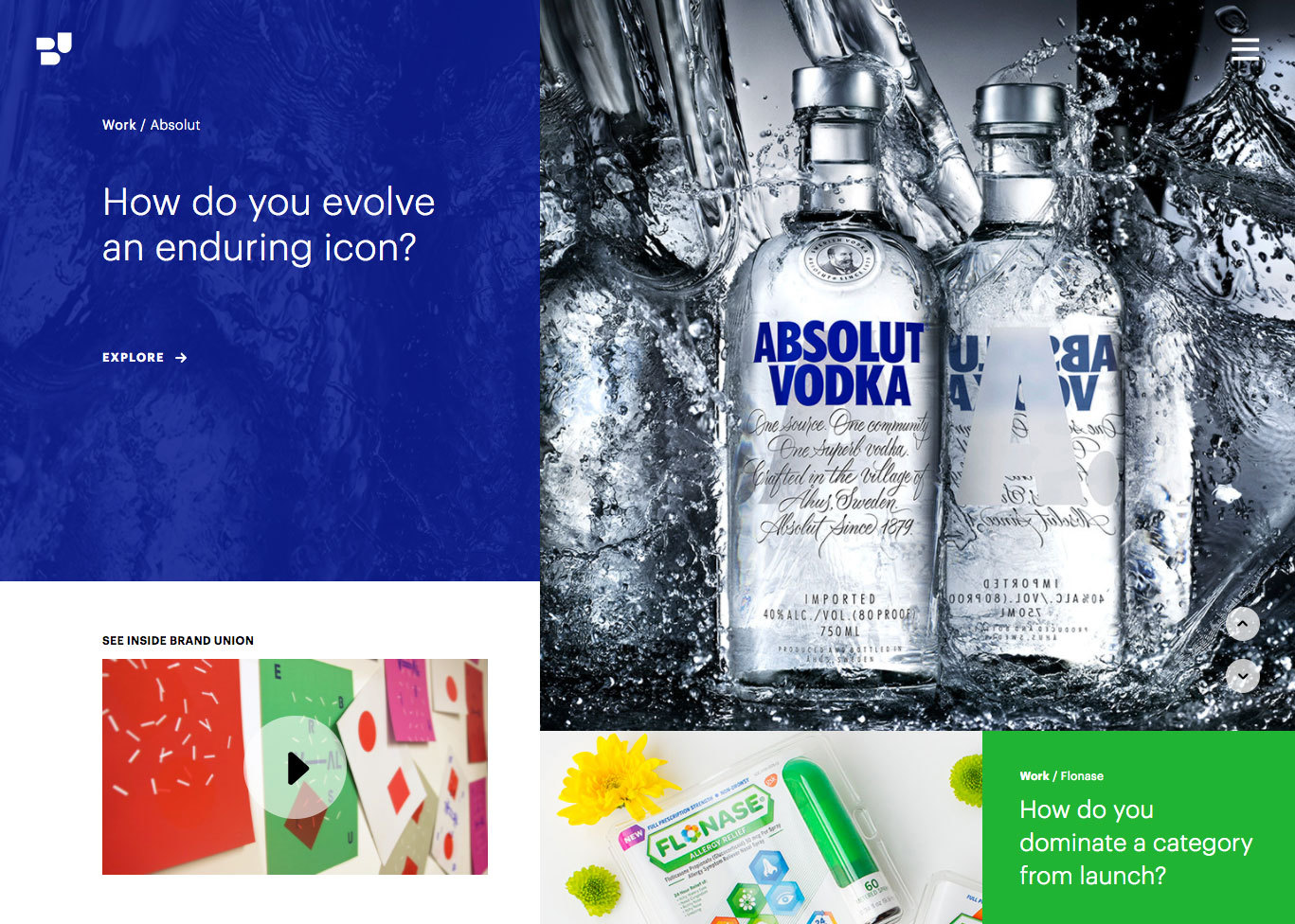
The Challenge
The agency global website was “not fit for purpose” anymore. We needed a new presence, that showcased the very best work from the Brand Union network. We needed to support an ambitious plan to generate fresh thought leadership content. There were some obvious UX problems that needed addressing. And it needed to look good.
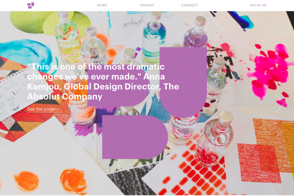
The Process
UX Activities
- Analytics Review
- Agile Sprints
- Content Audit
- Information Architecture
- Personas
- Prototyping
- Stakeholder Meetings
- Research
- UX Review
- User Journeys
- User Testing
- Wireframes
- Workshop
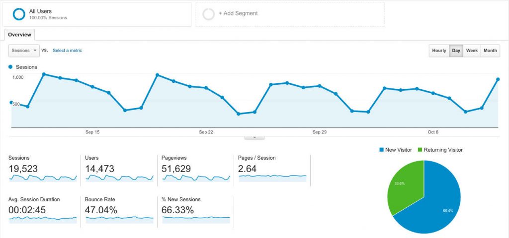
The first step was to conduct an expert UX review of the site, review the analytics, and conduct stakeholder interviews. That established where we were, what major problems needed fixing, and what further ambitions the agencies had for the website.
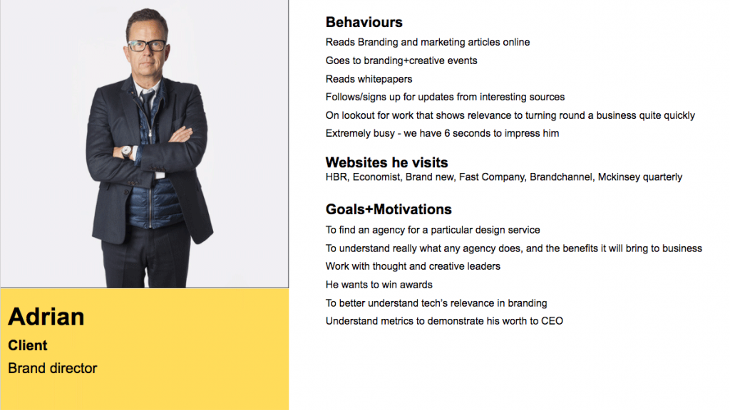
Then we made some quick proto personas, so the team could all think about who we were designing for and what they might expect from our agency site. We wanted to validate these as we went through the full project life cycle.
Combining my discovery activities with the strategy and creative teams, we were able to present our discovery findings to the global stakeholders and form the project brief.
Green light!
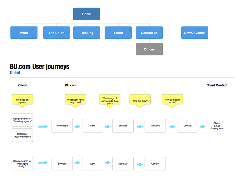
Next I went through several versions of user journeys and sitemaps for the website, so that we could start to think about the overall content and architecture. There were a few interesting debates about navigation labels!
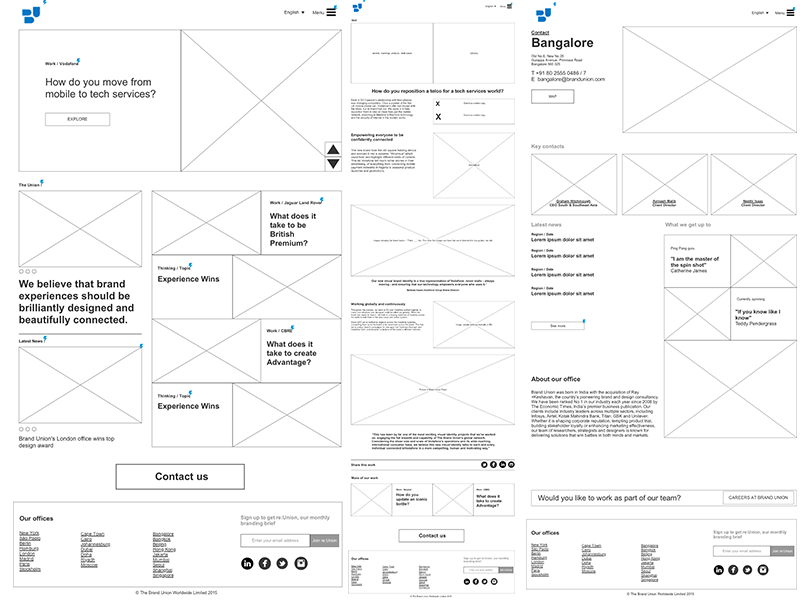
The next step was wireframe prototypes in Axure – I went through a gradual succession from low fidelity to medium, as the content definition began to take shape. One of the most challenging templates was, of course, the case studies. We had to make it engaging, but at the same time we had to be mindful how much resource and time we needed to put into creating the assets and copy for each one.
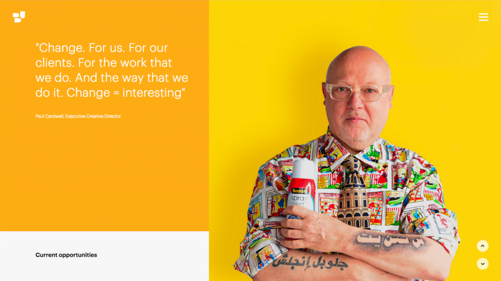
After that we went through a series of agile sprints, with the whole team working together to design the UI, build the front and back end, test, and coordinate content production into the final product.
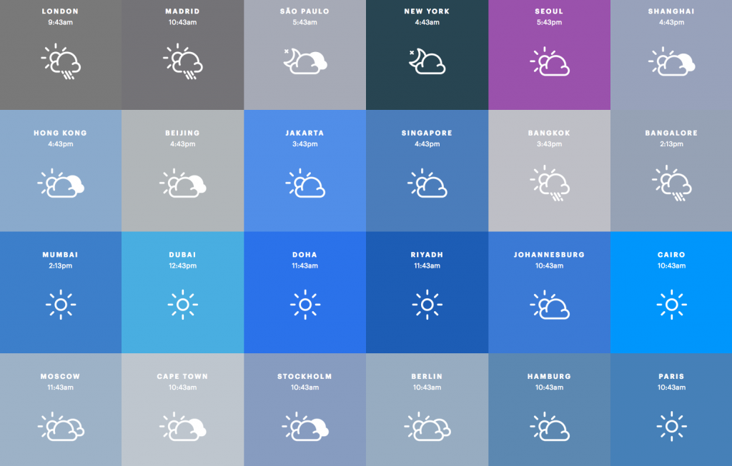
I conducted regular device and user tests, and worked with the team to iterate on specific design and interaction challenges.
The Result
We launched the new site, and the reception from the network was very positive. Analytics show that we have reduced bounce rates and drop offs, and increased engagement times and the number of contacts being made to our offices.

