
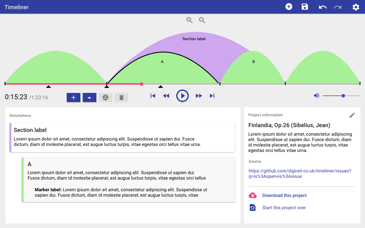
The Variations Audio Timeliner is an audio annotation and analysis tool for creating and labelling bubble diagrams. These diagrams can be used to navigate music or other audio for detailed study.
This desktop tool is typically used by musicologists and academics to analyse a given piece of music. They can load in a music file, and then mark points and regions in the music to provide a visualisation of the structure of the music, complete with annotations.
The challenge
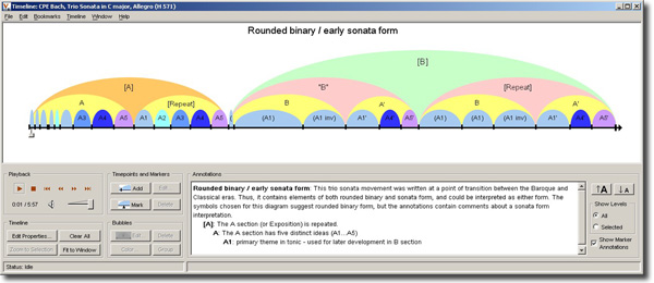
The University of Indiana, who developed the original software, wanted to create an updated open source version of the software that can be accessed using an internet browser.
UX Activities
- Desk research
- User research
- User testing
- Sketching and wireframing
- UI design with Adobe XD
- Interaction design
- Product Ownership
Research and ideation
I began by researching the original software documentation to understand the original features in the timeliner. A lot of work and usability effort had gone into the original product, so it was worth understanding what was there.
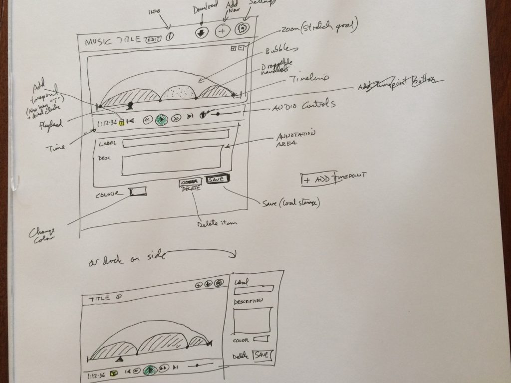
I started with some initial sketches for updating the interface, and reducing some redundancy in the UI controls. I wanted to create a UI that felt a bit less cluttered, with clearly grouped and intuitive controls. The goal initially was to create a user experience where the manipulation of the bubbles and annotations would feel effortless.
I passed the sketches around our team for quick feedback.
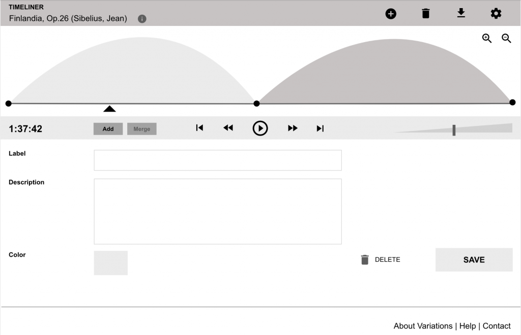
After that I made some wireframes so that I could share them with our team and our client, who know the product very well, to gather early feedback on the proposed UI.
Design and testing
We had a pretty small budget for the first phase of the development of this product, so I decided to leverage Material Design to make it easy for me to design up a professional UI quickly, and for the development team to have access to ready-made theme-able components to use for building it.
I worked up an initial version based on my wireframe, including user flows, then we built the UI, and after that we performed user testing with actual musicologists and teachers to gather feedback on the design and usability of our product.
It was great to be able to hand off design specs to the development team using Adobe XD, where they could query any inconsistencies or elements that needed customising beyond the standard Material UI. I worked really closely with the developers to work through problems and understand how we needed to build the interaction design.
We then had a second round of iterating on the overall User Experience of the product, taking into account what we learned from our target users.

Lessons learned
I learned that, once again, until you really see someone using the actual product, it’s really hard to tell where the niggles are. I made a few wrong assumptions about what the interaction affordances for certain features should be, but once I understood that it was relatively simple to go back and tweak the design to improve the user experience of the product.
But also, getting a fairly high fidelity version of the product for the first round of testing was essential, as the concepts and interactions involved are hard to test in relatively static mockups or basic prototypes. In this case having a design system I could leverage was invaluable.
We had to work really hard to figure tiny microinteractions and how to arrange the UI controls, in a way that felt really clear but also worked when it came to the fine-grained details.
Next steps
The feedback has been positive for this new version of the Timeliner tool, with users commenting on how clear and simple the UX is for creating the visualisations and annotations for a piece of music. I look forward to being able to further develop this unique product.
You can try the pilot demo.