Responsive Design — or designing in a multi device world- is very challenging, but also very exciting and rewarding when it works well. However, agencies are finding that they need to change the way that they approach build and design because otherwise designing for a multitude of screen sizes becomes extremely painful (and expensive).
I’m going to outline the main things that I encounter frequently on projects, and what we can do about them.
Main issues causing problems on projects:

Lack of Content Strategy
I’ve seen very few examples where the content and the strategy for implementing it is fully considered. We rush into creating interfaces and, when we later try to fill them with content, things tend to fall apart.
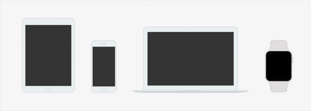
Desktop-first
We are still, despite how smaller screens are becoming the dominant viewport size, designing large layouts and then retrofitting anything below that size.
Designing for specific breakpoints
We all entered the consensual hallucination that the web is a series of designable breakpoints. This is just not a realistic approach in a multi-device world.
Designing fixed page layouts
We’re still seeing many teams putting together fairly rigid, inconsistent page designs, with bespoke components for each.
The waterfall method
Still the predominant process of design and execution, which does not work well for complex digital projects:
Client → UX/Design → Developers → ouch → Launch → d’oh
Visual design over performance and speed
A beautiful interface is wonderful, but when your website is slow and the User Experience is clunky, it doesn’t really matter.
How can we do better?

Here’s some suggestions for improving each of these issues
- Design mobile first (I have this book)
- Consider the in-between (Check out this demo and select the Disco option!) and design content-out
- Start generating patterns and systems that are flexible and responsive (demo.patternlab.io and Atomic Web Design). These could also become online style guides.
- Get into the browser earlier, and have more iteration between Client-UX/Design-Development
- Get a Content Strategy, write good content for online (this book)
- Consider having a performance budget for your designs (Setting a performance budget)
This is a broad overview to a very big subject, and one that even the best teams out there haven’t quite figured out, but I wanted to write something down to express what I see as the main problems I experience in my job. I haven’t really touched on more technical and performance issues (progressive enhancement, responsive images etc) in this post, as that probably needs another post.