I guess I’ve had a site of my own since about 1999. I recently re-built this site, mostly because my WordPress install kept falling prone to various vulnerabilites, but also because I tend to redesign it every couple of years out of boredom and a need to express where I’m at.
Each time I’d do a redesign, I’d be determined to clear away the old and start afresh. Although for quite sometime I had my old sites archived on a local hard drive, eventually they got lost when my old Dell laptop died and I mainly used my work Macbook Pro for anything I wanted to do online. As Jeremy Keith points out, it doesn’t matter whether these homepages are ugly or beautiful, it’s a shame to lose these old artifacts of self expression and internet history. And so recently I came to regret not keeping hold of every version that I have done, no matter how dated they are.
So to the partial rescue comes screenshots.com and Wayback machine. It’s so awesome that someone is still trying to preserve parts of the internet that have been lost, when these days you cannot depend on any hosted services to keep your data safe. I host my site with my cousin, and now that I got my site into a GIT repo I’ll be able to keep it’s historical versions available via a few simple commands.
So here’s the brief history of my site, I loved seeing how it’s progressed and the reasons behind those changes. I am by no means a great designer, but I love my craft, and to me it’s fun looking back at my work from my own perspective.
From the beginning…
Pre 2003
Alas, this part of history is lost. It’s a shame, because the early sites had various multimedia craziness going on, using Flash, Poser, Premiere and other wacky things to show how multimedia I was.
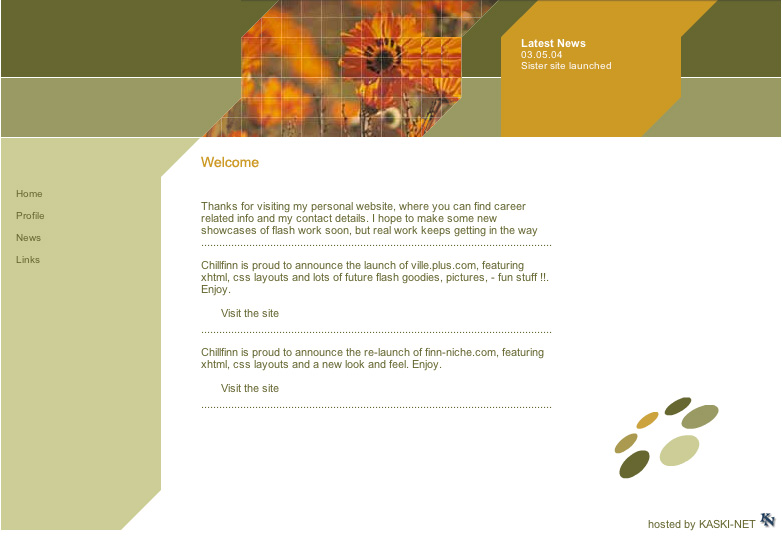
Here’s the site from around 2003, at this stage I’d been working for a few years and had just started working at an agency specialising in Investor Relations. I think I was trying to emulate the design of Razorfish at that time which I thought was super cool. You can see that the content is pretty typical of that time – the site itself is my portfolio, then it has really uninteresting content areas because at that time for me content was always an afterthought (shame that this is still the case in many projects I come across today).
Fixed-width, table-based, slice-and-dice layouts of course. I think my favourite part was the perspective circle thing, I drew it in Macromedia (Yes! Macromedia!) Freehand and then exported into Flash to animate it. Hotness.
2006
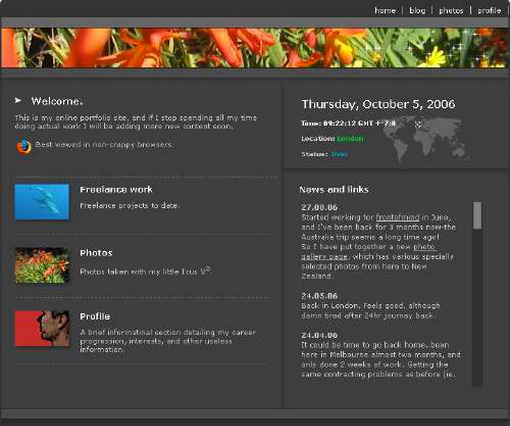
I started making this site a little bit before I started getting itchy feet – always a sure sign. I had discovered CSS layouts and had been using them at work. It was a learning curve but it made things exciting again!
The design was probably influenced by Joshua Davis and the kind of Flash-based aesthetic that was going around that time.The dark grey backgrounds, styled scrollbars, mini-news feed boxes, tiny Flash maps. This bit was interesting – there was this desire to indicate where you were at that time, and your status. So we’re coming up to the time when twitter. facebook and all that starts becoming more widely used.
The content format of the site is still about the same – but at the same sort of time I also left my job in London to go travel in Australia and New Zealand for about 9 months, and had started a WordPress Blog (it may have been in the sub-directory). This is when I started making interesting content – I had something to talk about that was interesting. I never found that I felt the urge to blog about technical things, even though I enjoyed working as a developer. I think that I needed something beyond work in which to express myself, and travelling is a great way to do that.
2007
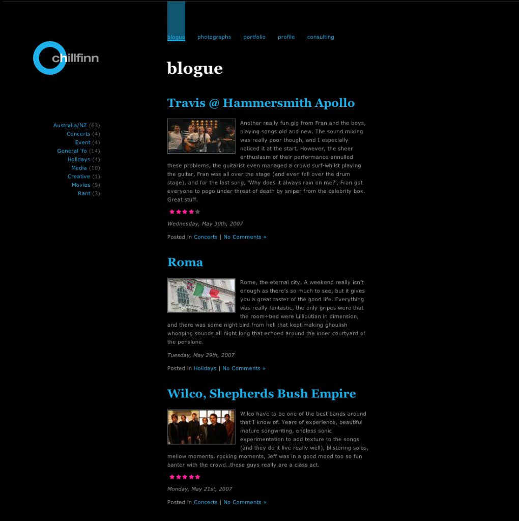
This is still one of my favourite designs. It was definitely inspired by Monocle magazine, which I had started reading. I love the richness of the black background and the tritone colours of the site – black, white and a zingy sky blue. I had discovered grids also, and I felt like my use of space on this was nice, it gave nice breathing room compared to my previous designs, which were quite crammed. Because textual content had become the primary focus, I had started considering typography more than just trying to design rich multimedia interfaces. This was a key step in my design approach.
Content-wise, during and after my travels I realised that a website is only really as interesting as its content. So the blog moved up to the top level of chillfinn.com, displacing the general areas I had before. Initially I was going to stop blogging because, quite rightly, I figured that trying to write about work and everyday life in London for me was not going to come out as sustainable content. However, I made an attempt to blog, and so the focus of my site had now changed.
2008
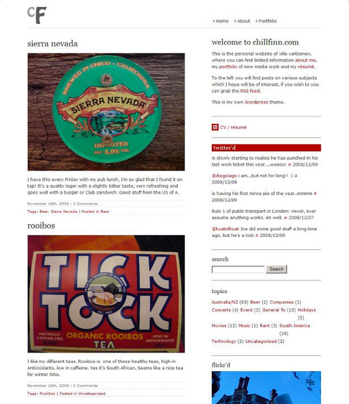
This design was inspired partly by the Kottke.org site at the time. Some sort of Swiss influence too with the red accents. I made a terrible job with the new logo, but there you go.
Content-wise, I was blogging in vain about various everyday topics, and then my use of twitter and flickr made an appearance on the site. The age of social media was on.
2009
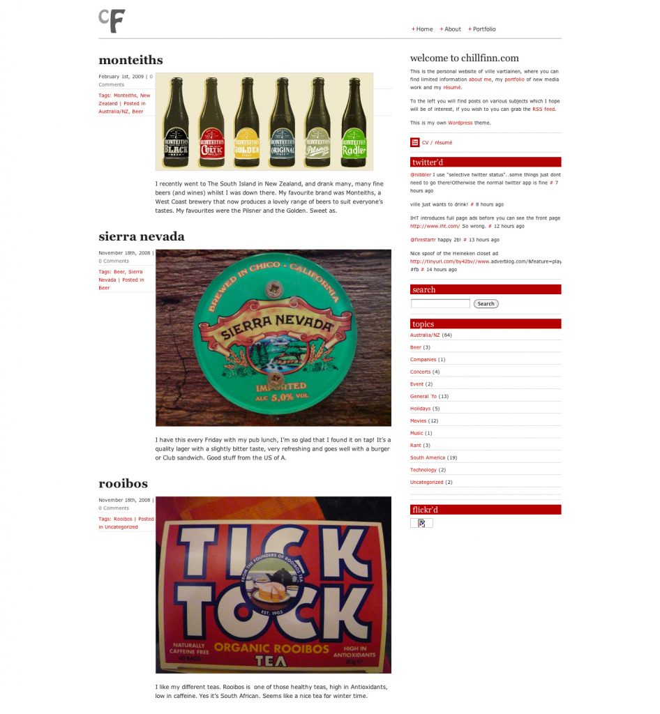
A slight tweak to the design – I think I was being influenced by Khoi Vinh’s Subtraction post format, with the post meta data displayed to the left of the post.
2010
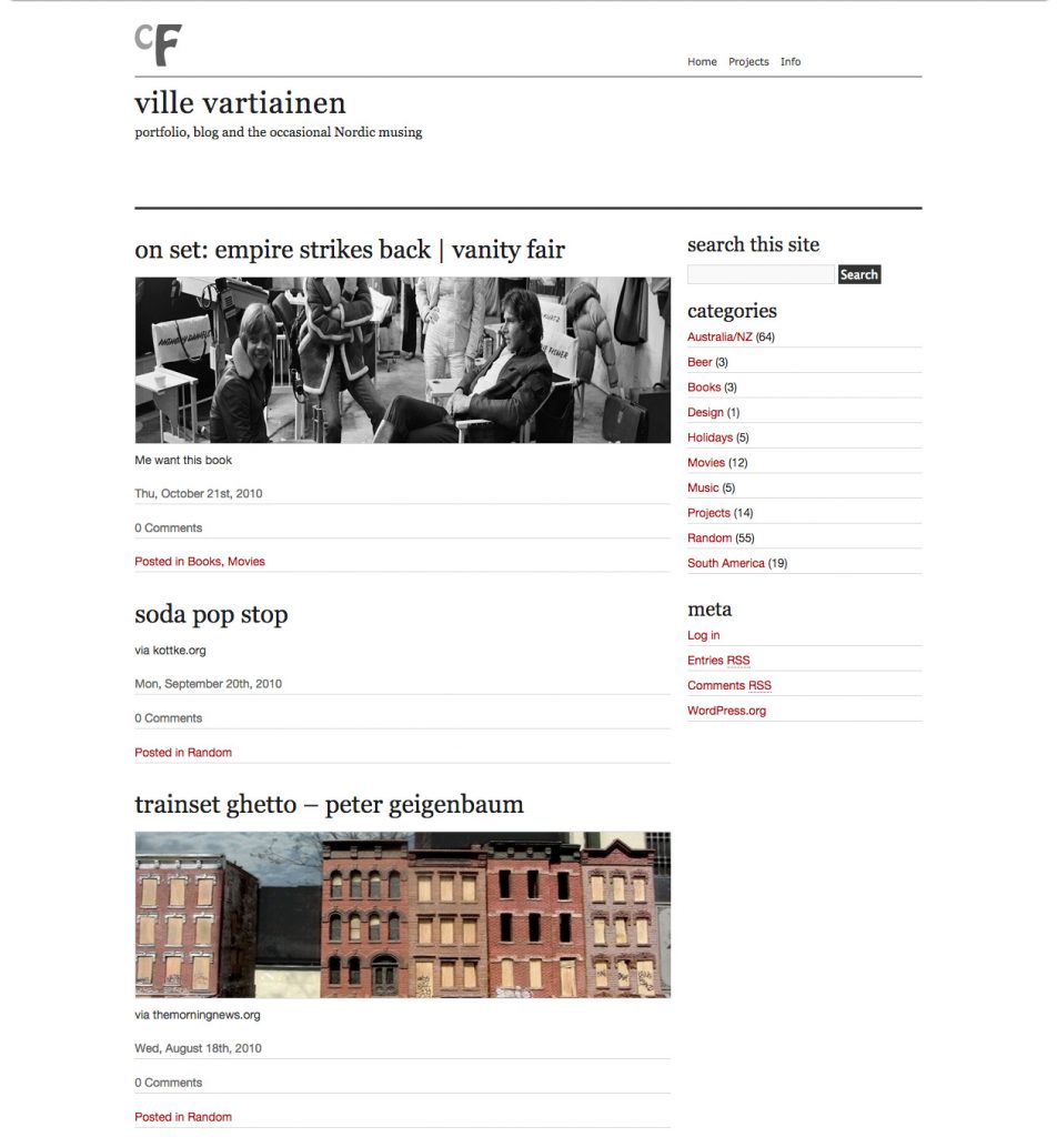
Design-wise there was this really nice WordPress theme making the rounds, with a really nice minimal header area constructed with horizontal dark lines. I loved it so I used a slight variant of it and tweaked my theme to suit.
2011
Certainly by this stage my world had been rocked again by seeing Ethan Marcotte’s talk about responsive design. Like going from table-based layouts to CSS layouts 5 years earlier, it was a steep learning curve but it made things exciting again. So now I had moved onto the single column design, because when you do Responsive Design it’s really worth considering the value of everything that you place on your page – the sidebar was just a filler. Again the focus was on the content, so big focus on typography and giving content the centre stage.
The new logo was inspired by many contemporaries at that time, but I had to keep it simple because I am not a logo designer and with the appearance of high resolution retina screens, I wanted to keep as many graphical elements in a non-bitmap format. The log is easily scalable and doesn’t get fuzzy!
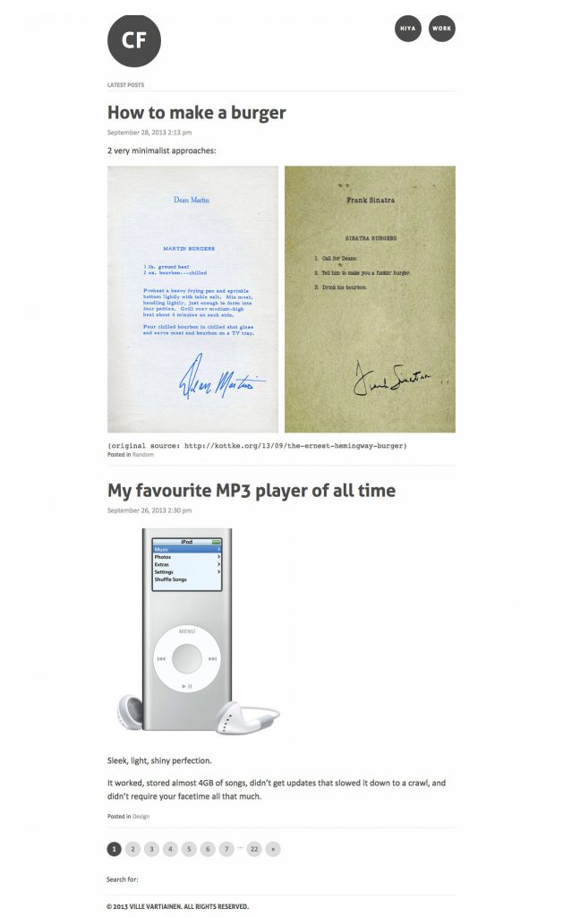
2013
The design stayed largely the same, but I sub-themed bits of the site – the homepage briefly had this full bleed background happening for a while, with the logo reversed and subnavigation becoming transparent. My about page fully reversed the colours on the page, so dark background with white text.
Content-wise, it had been apparent to me that I was struggling to blog about anything in an engaging way, except if I was travelling.
2015
The headaches of maintaining a secure WordPress installation started to grate, and I also conceded that I was not going to write very often about anything. My main activity today is on twitter, facebook instagram etc, and so I could think about doing something that didn’t require a full on CMS. I ported the site over to Jekyll, and then using the default theme as a start, tweaked it to make what you see here.
I introduced the wonderfully named “goldenrod” as my accent colour*, and changed the font pairing for my text.
As ever, it’s an on-going thing. I’ve kept all my travel posts safe, and a few selected gems, but otherwise the focus of the site is simplicity and a few portfolio pieces.
- Update: New Year, new color, going with blue in January.
2016
I’m trying out fluid typography. One of the main things that bugs me about responsive layouts is how you have to start adding stuff to the layout as you scale up from mobile – usually this feels like doing it for the sake of the visuals, rather than enhancing the User Experience. Especially on a site like mine, which is simple in it’s content, following a mobile-first mindset makes it hard. You could go the other way and cut things out, but then that’s desktop first.
So I thought it might be fun to try out this awesome new technique, and to see if it makes a better experience. At least for me, I love having my design change proportionally as the viewport changes, and I’ve just set one breakpoint (I think) to switch between desktop and mobile layout.
Additionally I did a content audit and thought about how to focus what I write about. I think it’s been a good exercise, and having the opportunity to redesign with all the content (with a few additions) is really refreshing – much more satisfying than the usual “Content last” routine.
2018
I’m not happy with the typography on article pages, I think it works on landing pages, but the gets really messy, the line-heights are all wrong as are the line lengths. Also wondering if I should go back to WordPress, since the Gutenberg editor is out soon. I could compose in IA writer perhaps and publish to WordPress and to Medium. Or I could just stick to keeping it simple. Let’s see. Also the visual design might need an update. I think it still needs to feel more efficient, tight, non-fussy.
2024
So this is probably the first year when I have used a customised WordPress theme to design the look and feel of this site. Why would I do that?
Honestly it came down to a few things:
- I needed to refresh the design, write new case studies, and I didn’t have much time
- I actually enjoyed customising the theme and playing around with styles and layouts
Having said that, if I get more time, I’m kind of itching to code a bit again, and to gain complete control over the design I’m tempted to do it myself.
2025
Small update – I’m using the twenty twenty four theme but heavily customised by myself. I’m hoping that it will help get me my next dream role.